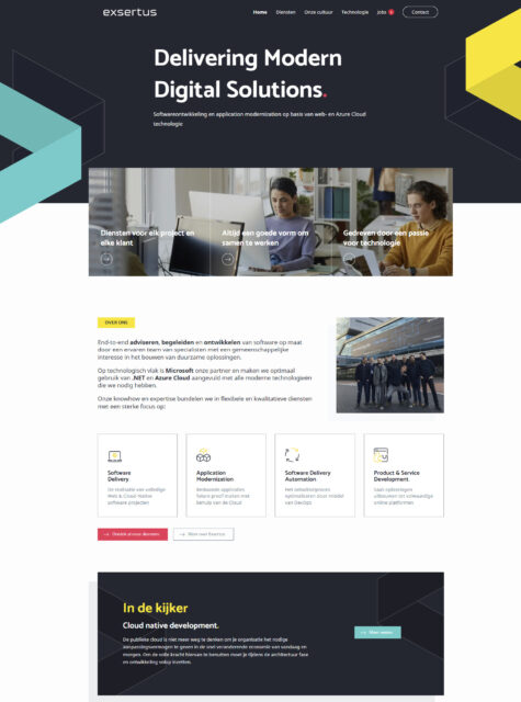
A lick of paint is too easy to say; actually RMDY stripped it a full interior. Our UX designer Wim created a new logo and corporate identity, including a different color palette. With the new brand guidelines in one hand and the already existing content in the other, he went to work on wireframes and designing the effective layout of the web pages. Important to Exsertus was that their offering had to be clearly eye-catching, on any device or browser.
Also important? Responsiveness, performance and freedom to customize. That is a job cut out for our web developer, Birger!
Because at RMDY, they don’t like ready-made templates, they always build their custom-made WordPress websites. For Exsertus they started with a custom template and numerous building blocks, the Gutenberg-editor ensures that it is all manageable and adaptable for the client afterwards. All elements can be adjusted in color or text, such as the braces at the top of the homepage. Really everything in the website, up to the images and icons, were optimized according to the latest techniques so that the performance and user experience are optimal.
Then responsiveness. Besides responsive design, they also combine liquid design. The result is a very user-friendly website that, for example, when resized for a smartphone, gets an extra button or a fold-out menu in different places to keep it clear for the user.
The final interior makeover was received with great enthusiasm! Exsertus itself will remain fully in the driver’s seat in terms of textual and visual adjustments, RMDY will maintain the technical side. And that’s how RMDY makes sure their clients grow and glow .
Check out the result on the Exsertus website itself.
